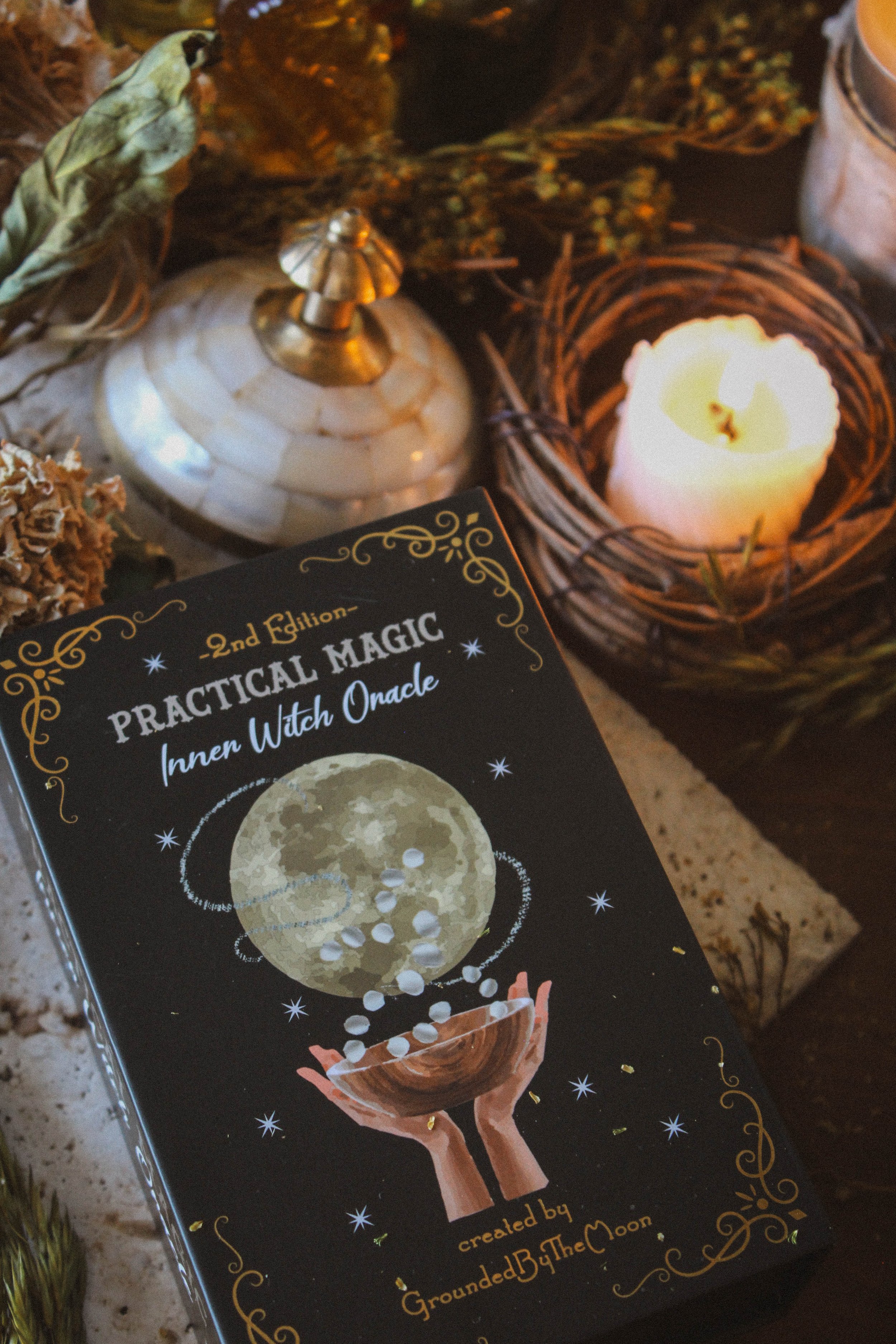
Practical Magic Inner Witch Oracle

This page may contain affiliate links which may allow us to collect a commission when you click and make a purchase through the links on our site. There is no additional cost to you for doing so.
Created By: Ground By The Moon
Publisher: independently published
Number of cards: 46
Card size: 4.75 x 3.75 inches
Box size: 5.25 x 3.5 x 1.75 inches
Guidebook pages: guidebook pages weren’t mentioned
Purchased or gifted?: gifted by author
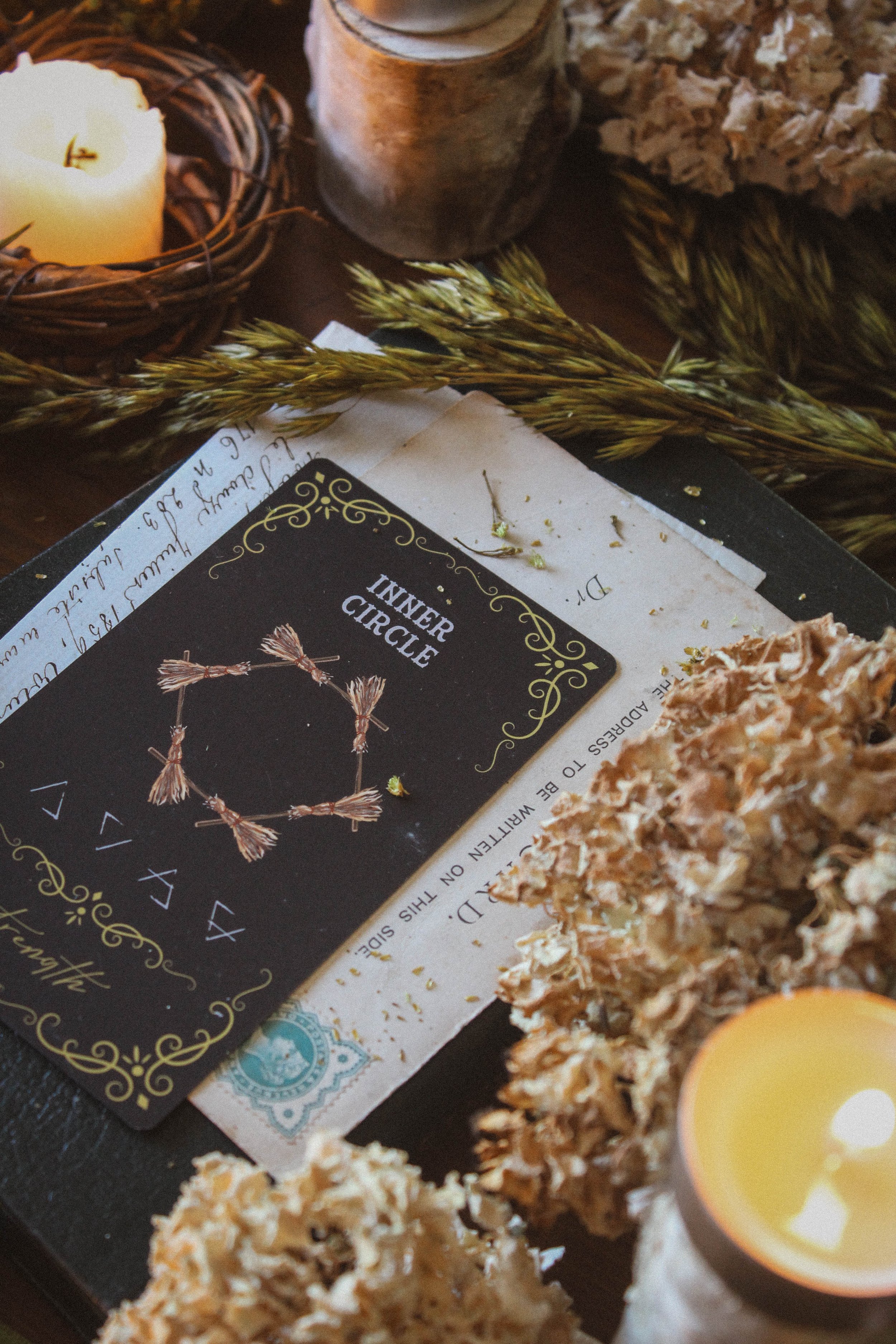
Absolute favorite card: Inner Circle
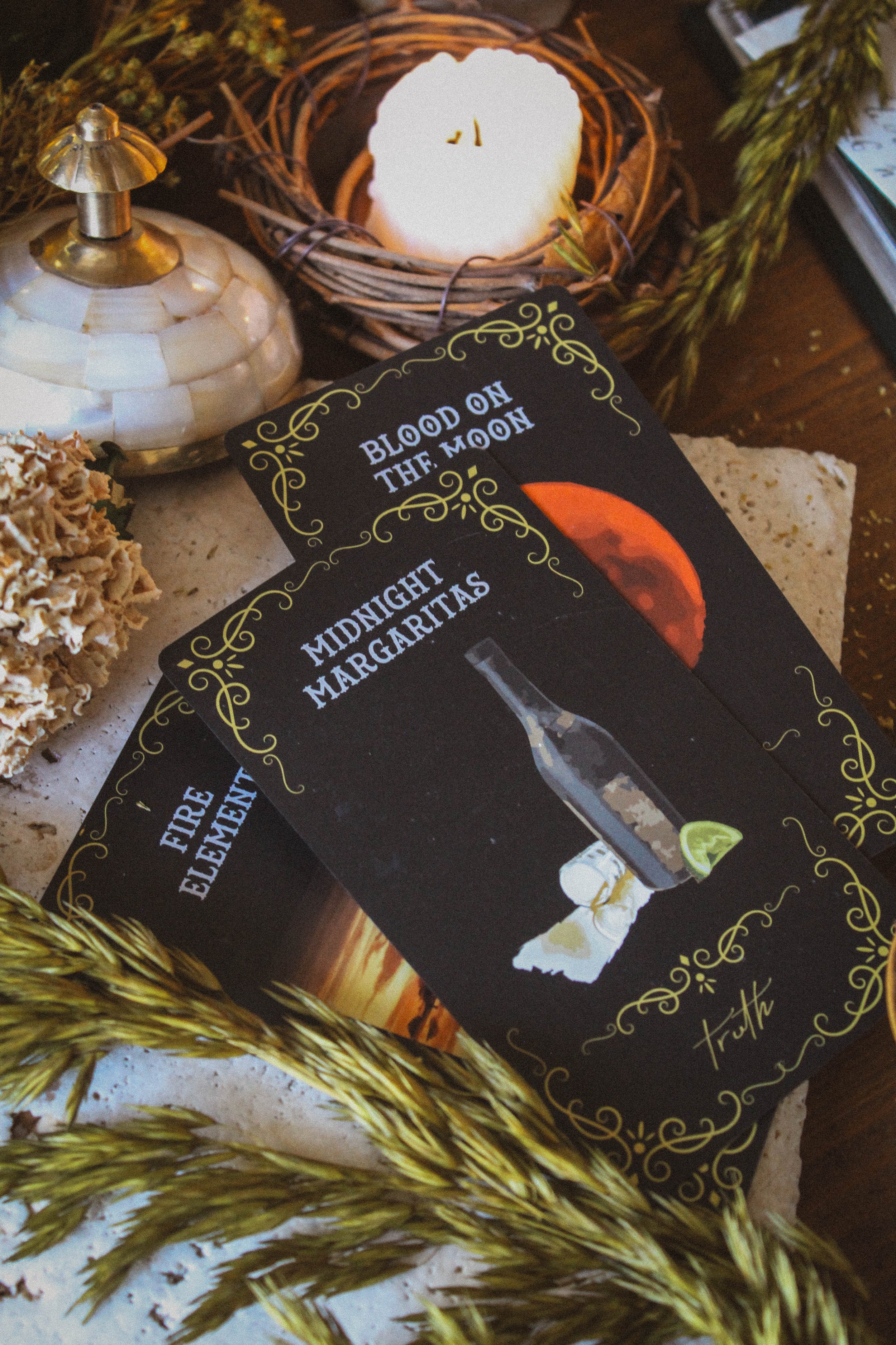
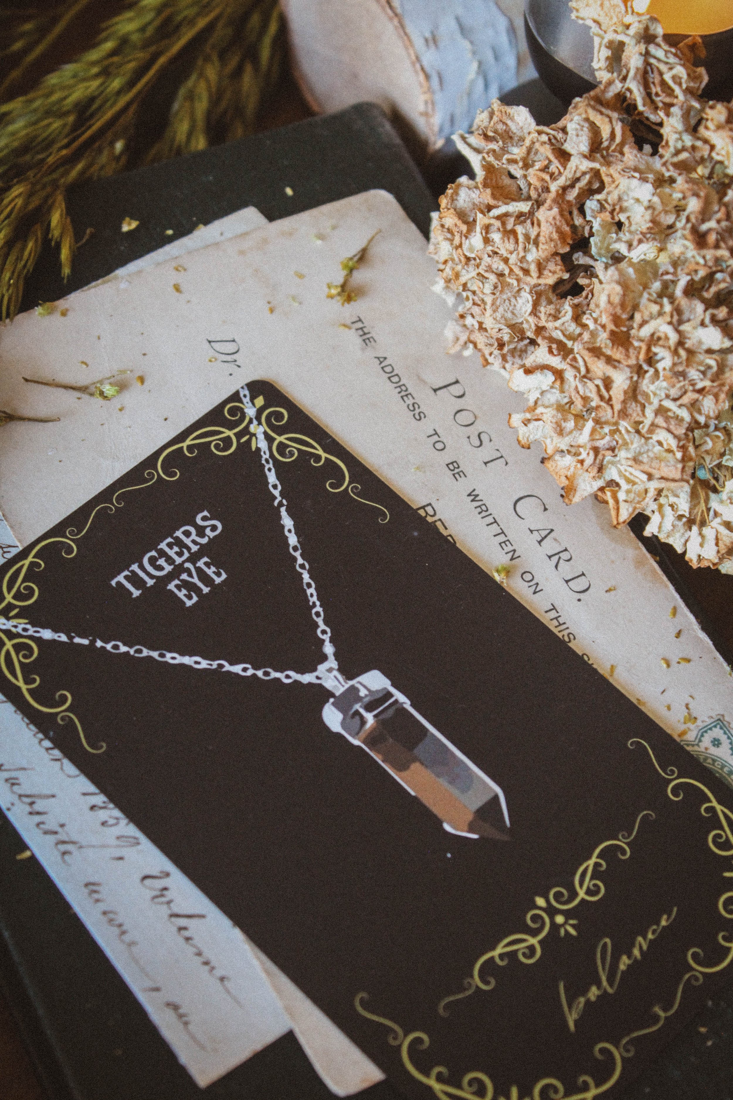
Other favorites: Midnight Margaritas, Elemental Cards, Blood on the Moon, Garden Gate, Tigers Eye
Notable detail: Spreads printed on cards, black edges, full and new moon cards
Season: Winter
Sabbat: Samhain
Sign: Scorpio
Tarot Deck compliment: Practical Magic Inner Witch Tarot
First Impressions
My first thought is that the packaging is really well done. It’s pretty accessible to create and print your own oracle deck these days and sometimes I find myself asking how long I really want to stay with a publisher. Frankly, independent artists are putting out some incredible offerings that are certainly comparable to mass market versions. With this deck, the first thing that really stood out to me is all of the black. Black box, black cards, black sides and black guidebook. On my first pass, I saw the card Midnight Margaritas and then toad and I thought to myself “Is this based on Practical Magic?” And sure enough, it is!! I didn’t know that when first looking through it but once I found that out, this deck became so nostalgic and heartwarming. I really can’t explain it but there was an instant shift and deeper connection with it. But as always, I’ll dig in deeper in the individual sections.
The Packaging
As I mentioned before, the box is quite nice. Its study with a book fold with magnetic closure. Inside, you’ll find a bright yellow ribbon that is used to like the cards out of the box which is absolutely necessary for a box like this although you’d be surprised how many times a mass market deck is missing it. There’s also printing inside the tops and bottoms of the box. It’s been a while since I’ve done a deck independently (the first version of Seasons of the Witch: Samhain was independently published), but I remember how each added detail adds another layer of cost and it's all too easy to want to skip past them but you can tell the creator invested into this deck and I appreciate that.
The most notable thing about the packaging is the black gilding on the sides of the cards. It's not a color you see too often and this one is so rich too. It has a rainbow quality when it catches the like and you can see the dark navy tones when you photo it (see photos below). It's like a holographic black rather than just a matte black and I think that’s super cool.
The cards themselves are very easy to shuffle and give a very satisfying, crisp sound. A lot of times cards need to be broken in but I didn’t have that experience with these. The cardstock is perfect. This may be an unpopular opinion but I prefer my cards to be on the thinner side. Thicker cards are harder to shuffle and since I have small hands, a lot of times I can’t hold them comfortably and cards go flying everywhere.
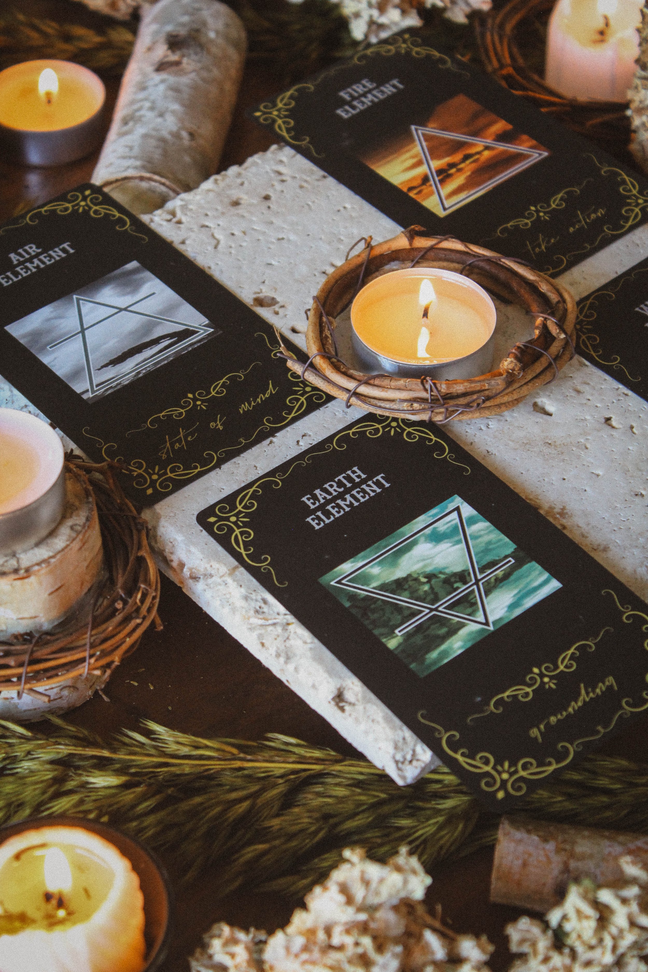
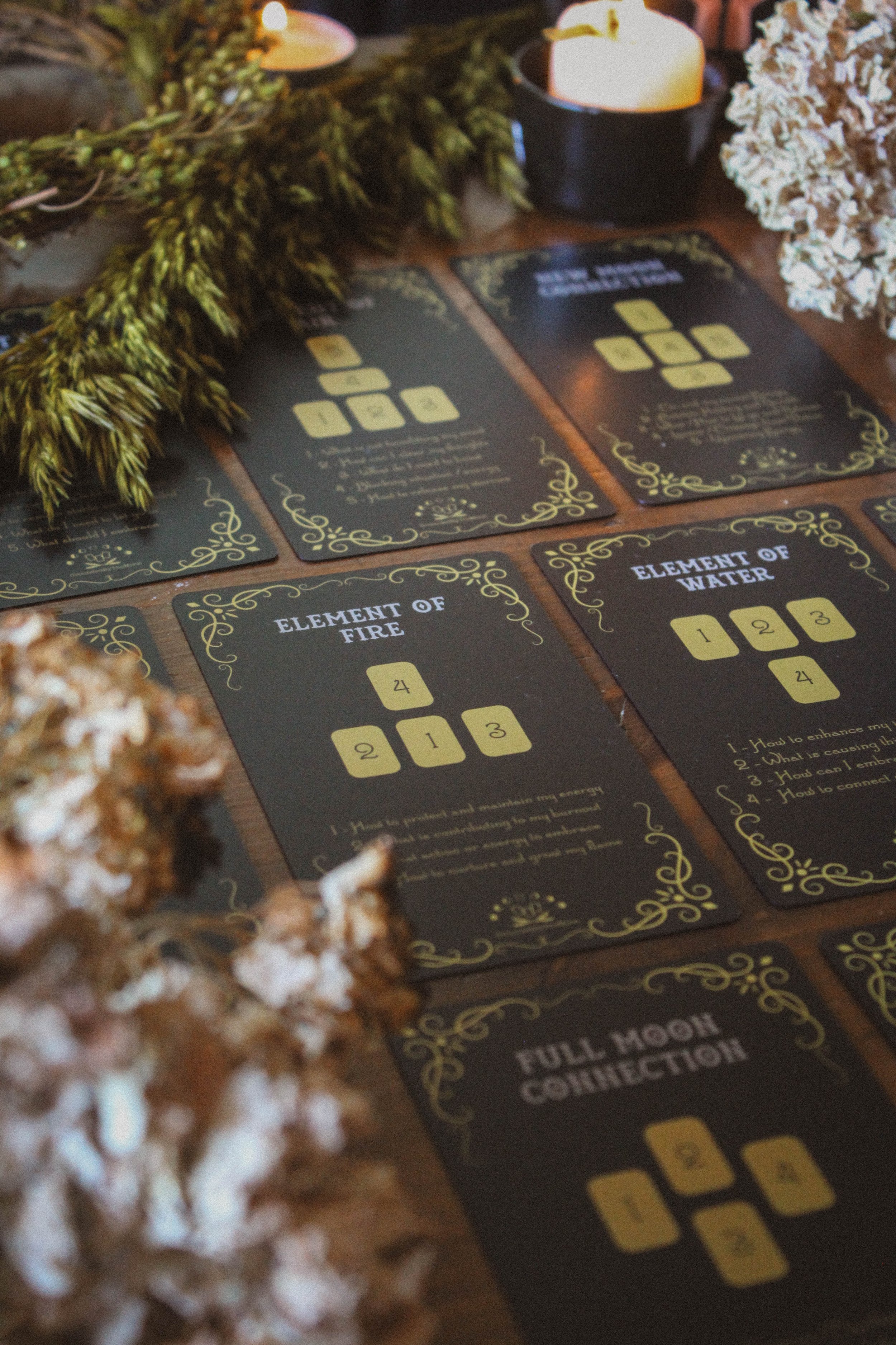
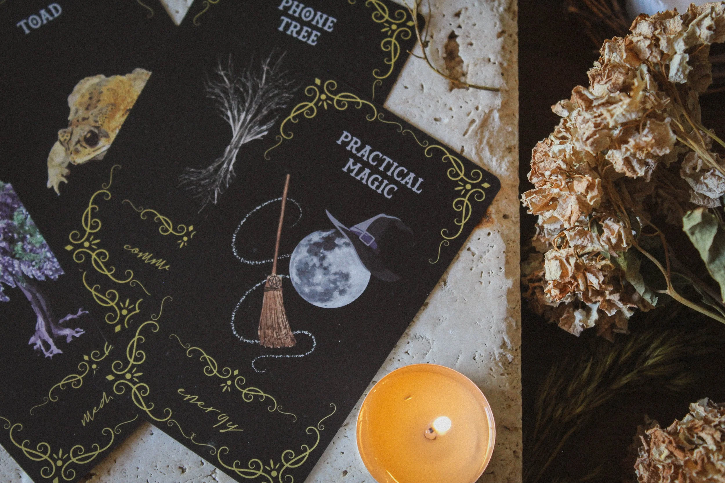
I lied. The most notable detail is the inclusion of the spreads on cards. I really love this idea and I shamelessly say I may have to steal this one. It's kind of a hassle trying to keep the guidebook open while you pull a card spread. That’s why I usually include a PDF of the spreads in the bonus material but having each one printed on its own card is so much more convenient. You can prop it on your altar or lay it down on the table without struggling to hold the book open. Such a good idea!
The Guidebook
There’s a fair amount of information in the guidebook. Each card entry has the image, keywords, the meaning and an affirmation. I do wish the keywords and affirmations weren’t in cursive. It looks amazing but it's pretty challenging to read. In all honesty, I did this too when I did Samhain Oracle independently but as a creator, you want a vibe, right? But that is the one advantage of working with a publisher. They guide you through things you wouldn’t really think of and while cursive is such an aesthetic, it isn’t ideal for readability.
The keywords are a little easier to read on the card faces though so not that big of a deal. Inside the guidebook, you’ll find an introduction, deck care, connecting with your deck, how to consecrate and dedicate your deck, how to use it and working with crystals in your practice.
The meanings are very thoughtful. You get the divination meaning but also some pretty thoughtful and practical guidance for actual ritual and spellwork. For example, Inner Circle has information on rope magic. Every card kind of has its own little ritual and I’m always here for another layer of magic.
The Artwork
I love the idea of the artwork. I love what I call spot illustrations; I have no idea if that’s the correct term but that’s what I call it, lol. It reminds me of the Green Witch Oracle and I think this type of more focused image can be really impactful. However, I do find myself wanting a little bit more detail with the imagery. The deck is based on Practical Magic and you can definitely see connections in the imagery. Some cards like Toad or Blood on the Moon feel like they fell right out of the movie which makes it really easy to connect with this deck if you’re a fan of the movie or the books.
“This deck was created to assist & empower you in your everyday life & on your magical journey of self-discovery.”
And that’s what's so special about the deck. It felt so nostalgic. I knew it was based on Practical Magic almost right away. Yes it's in the name of the deck but the term “practical magic” is all over the place and not always used correctly so you never know. But I could feel the love and reverence for the story in every card. My favorite card is Inner Circle which has the iconic scene of the brooms connected to save Gillian. Then it has the four elemental signs below that.

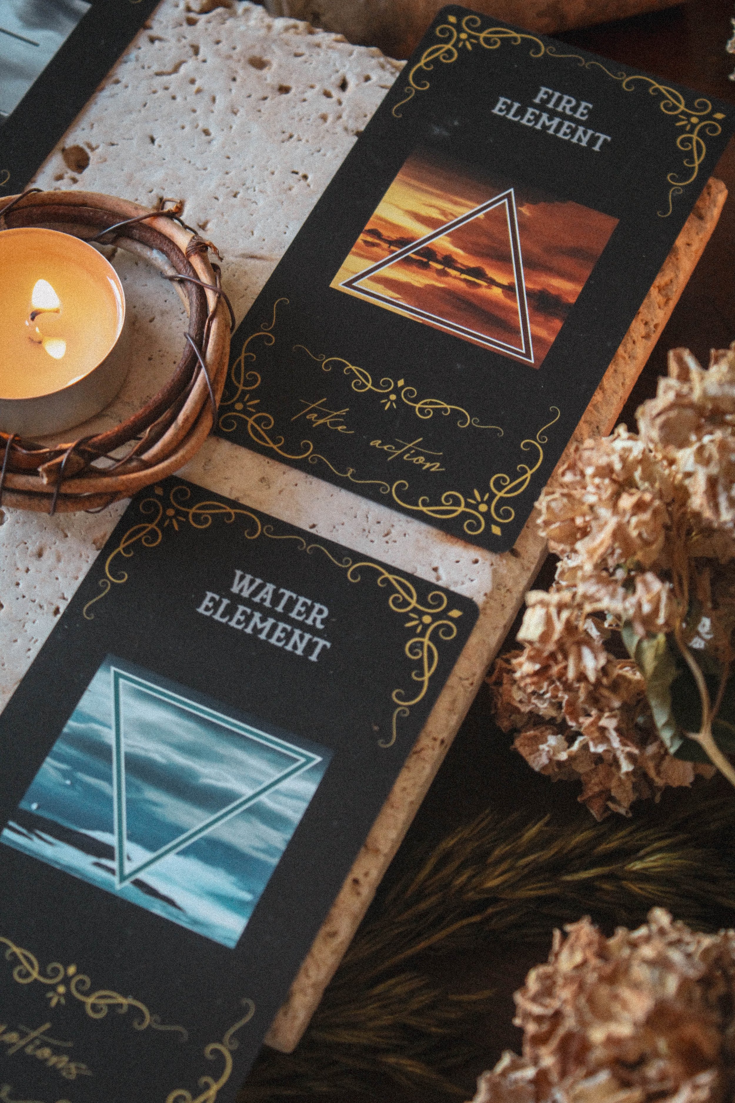
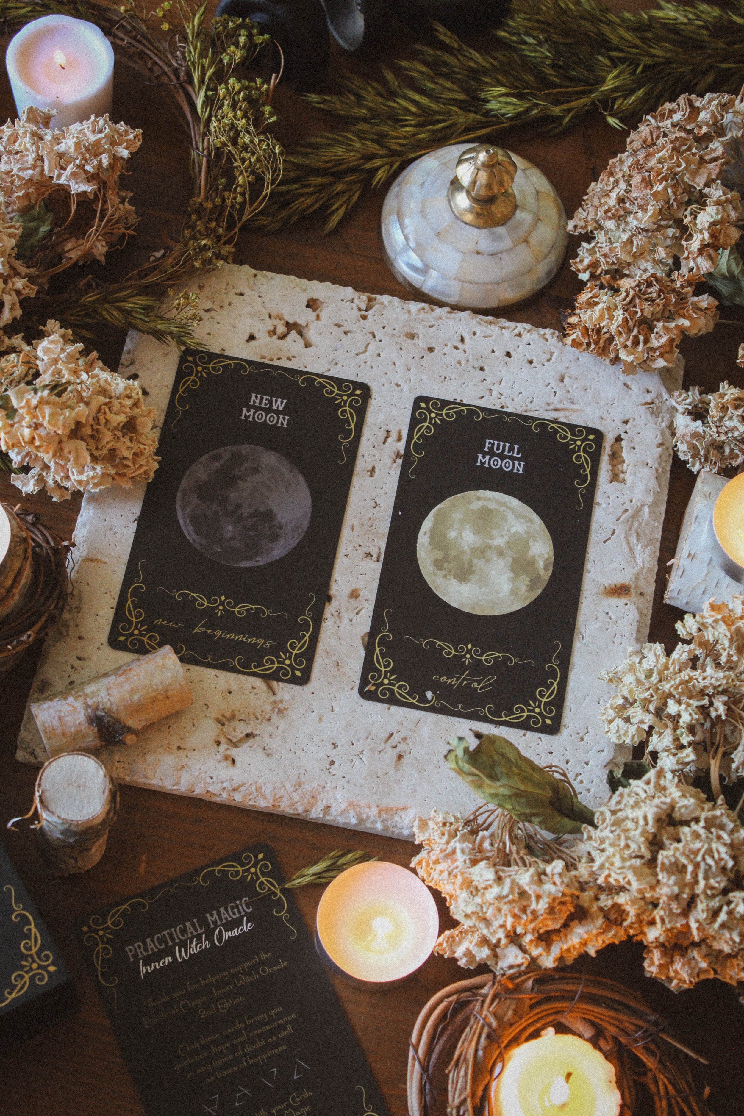
I also really love the elemental cards. I love working with the elements and I love the idea of having the elements in card form. You also have the new and full moon cards which I can never get enough of. I love pulling cards like these out of a deck and using them on my altar or to carry with me throughout the day.
I enjoyed my interview of the deck. I saw a very apparent theme in my reading and I think that’s the hallmark of a strong deck creator. Tarot and oracle readings are small narratives. Like pieces come together to tell a story that describes what’s happening in your spirit. If cards are too different, then you won’t be able to find a common thread. If all of the cards are too alike, then you get the exact same message over and over again. This one felt like it hit the sweet spot of just enough cards to weave the right story but not so much that it felt repetitive.
A pretty strong deck all in all. I don’t love the artwork but I don’t dislike it either. It's so deeply connected to Practical Magic that I find myself smiling every time I use it. I do think artwork is important. It's how most people connect with a deck; however, I have plenty of decks that I LOVE even though I don’t like the art. To be honest, you can put the traditional Rider-Waite in that category. I mean, how many of us actually like the way that it looks?
My point is that artwork isn’t the only way to connect with a deck. The theme, the guidebook, the creator, or the feelings it gives you are all excellent ways to find a deep connection with your new deck.
Season, Sign and Sabbat
I had to make the sabbat Samhain and the sign Scorpio. I mean those are the witchy seasons and this is definitely a witchy deck. The black also kind of just screams Samhain. I went with winter for the season. Technically Samhain is the start of winter so that also makes sense. The cards are so dark so it felt appropriate. However, I kind of wanted it to be summer as I believe that is the time of year Practical Magic took place. Anyone know for sure? Let me know. I don’t mind black in the summer.
Who is this deck for?
Do you love Practical Magic? Then you’ll love this deck. You’ll instantly be able to pick out details from the movie. You could practically lay out a timeline of the movie using the cards. But also, the inclusion of the card spreads are just so handy and I would buy it for that alone.
Tarot Deck Companion
There is actually a Practical Magic Inner Witch Tarot that goes along with this which I will be reviewing next week so stay tuned.
Thanks for reading all the way through. If you found this review to be helpful, informative or entertaining in any way, please be sure to leave a comment down below. It really helps me know what you’re enjoying so that I can provide more content based on what you love. In the meantime, please enjoy a variety of photos from this deck.
And of course, if there is something you’d like me to consider reviewing, please comment below or email me at hello@spiritelement.co


Some of my favorite cards