The Harmony Tarot Review
Created By: Harmony Nice
Publisher: U.S. Games Systems
Number of cards: 78
Card size: 4.75 x 3.75 inches
Box size: 5 x 3.5 x 1.75 inches
Guidebook pages: 148
Purchased or gifted?: Purchased myself (was a reader request)
Absolute favorite card: Le Soleil
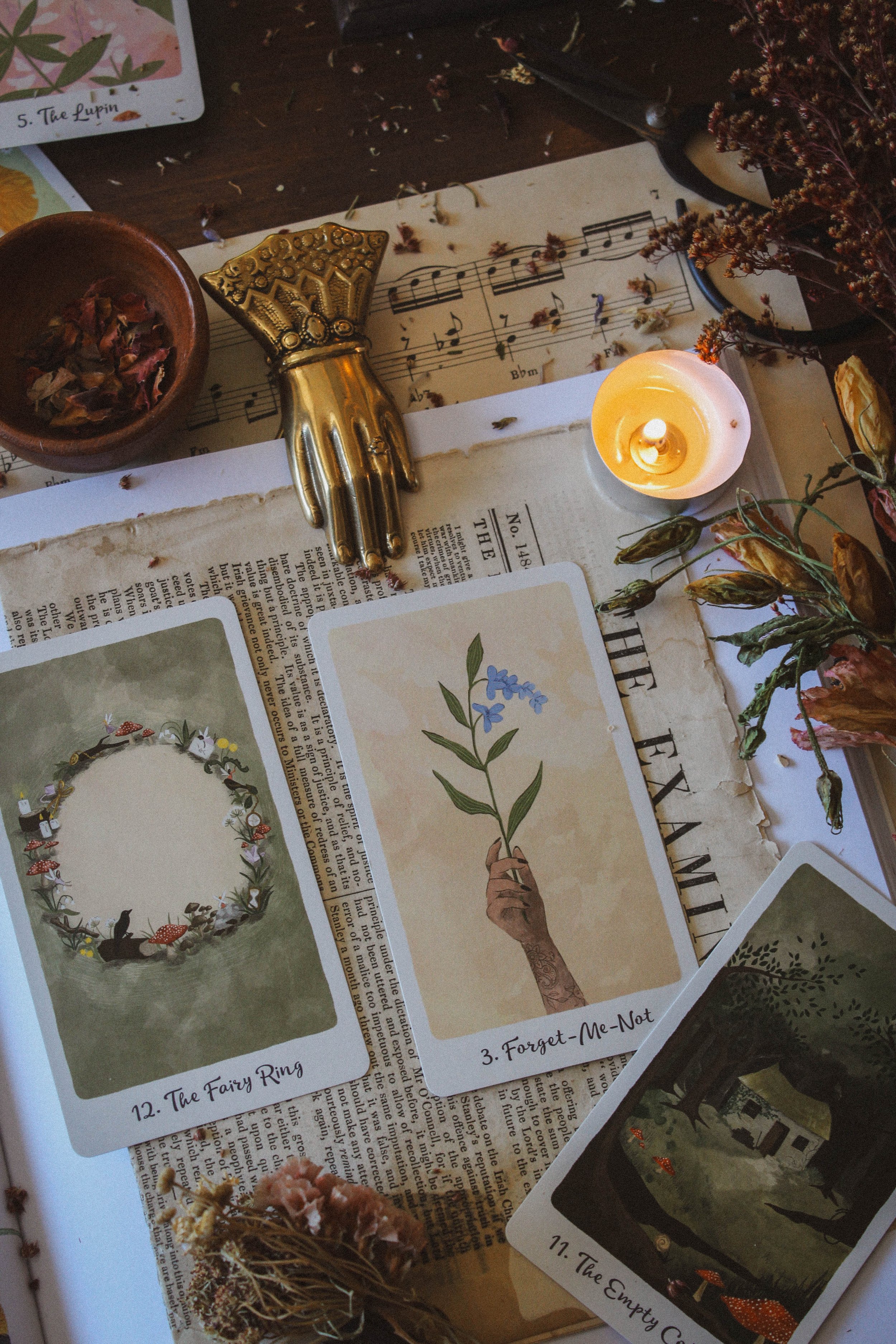
Other favorites: The Empty Cottage, The Cliff, two of winter, six of summer, Grace, Forget-me-not
Notable detail: Pink foil on box
Season: Summer
Sabbat: Ostara to Litha
Sign: Libra
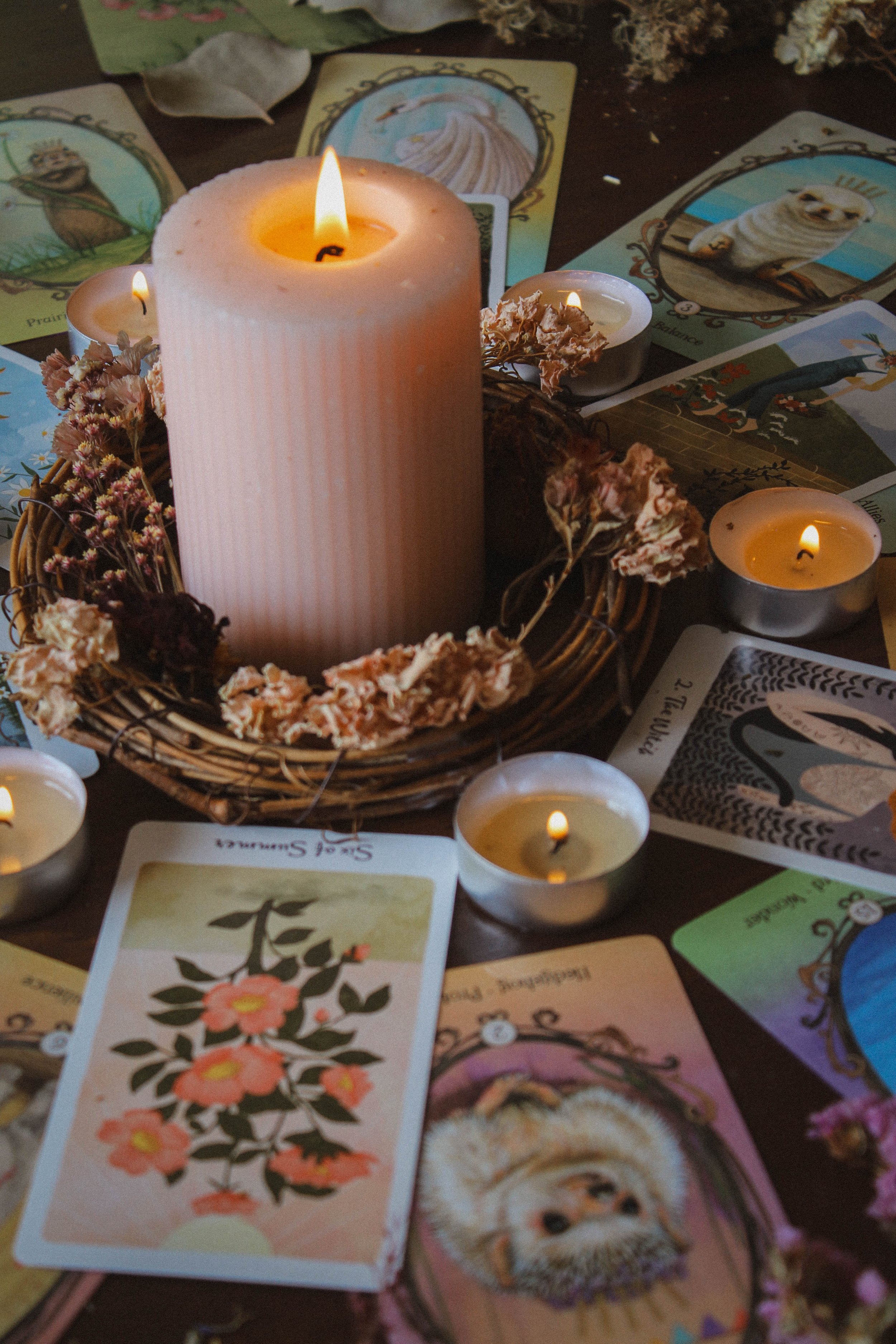
Oracle Deck compliment: Wing, Hoof and Paw
First Impressions
This was a reader request. I really like getting reader requests because it opens me up to decks I haven’t seen and didn’t know to consider. I don’t do all reader requests but if I am asked to do one that I resonate with, then I’m all for it. I loved the softness of this deck when I saw it. I’ve been really attracted to soft and gentle decks lately. I’ve really been leaning into feminine energy and the energies of grace, inner abundance, beauty, and nurturing and this deck seems to check all of those boxes. What I didn’t like at first glance was the artwork for the suits. The art is pretty, don’t get me wrong, but the suits are basically the same card on repeat but more on this later.
P.S. If you’ve created a tarot or oracle deck and would like me to review it or to take photos for you to use to promote your deck, I have just opened up a brand new service which you can find here.
The Packaging
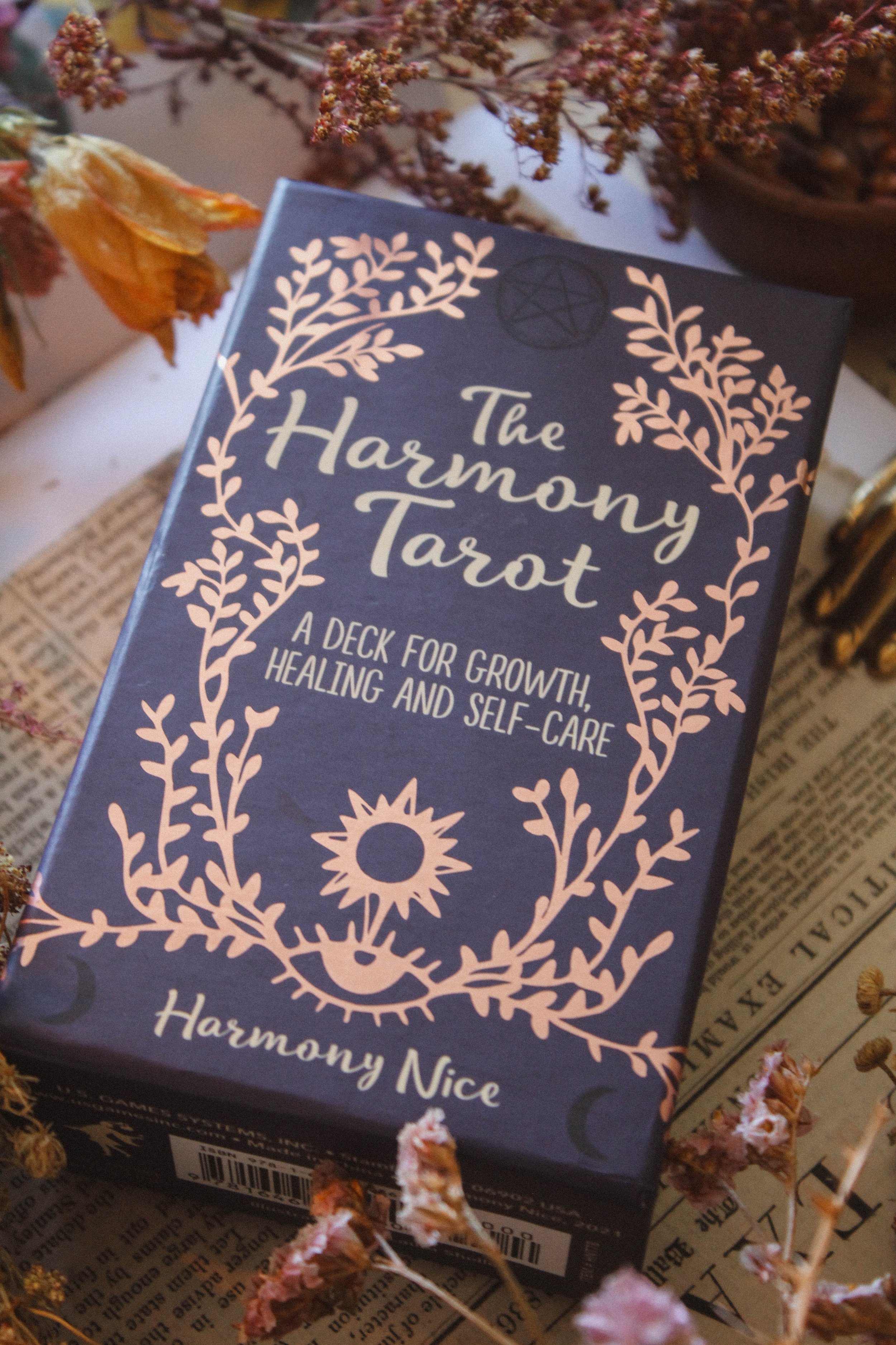
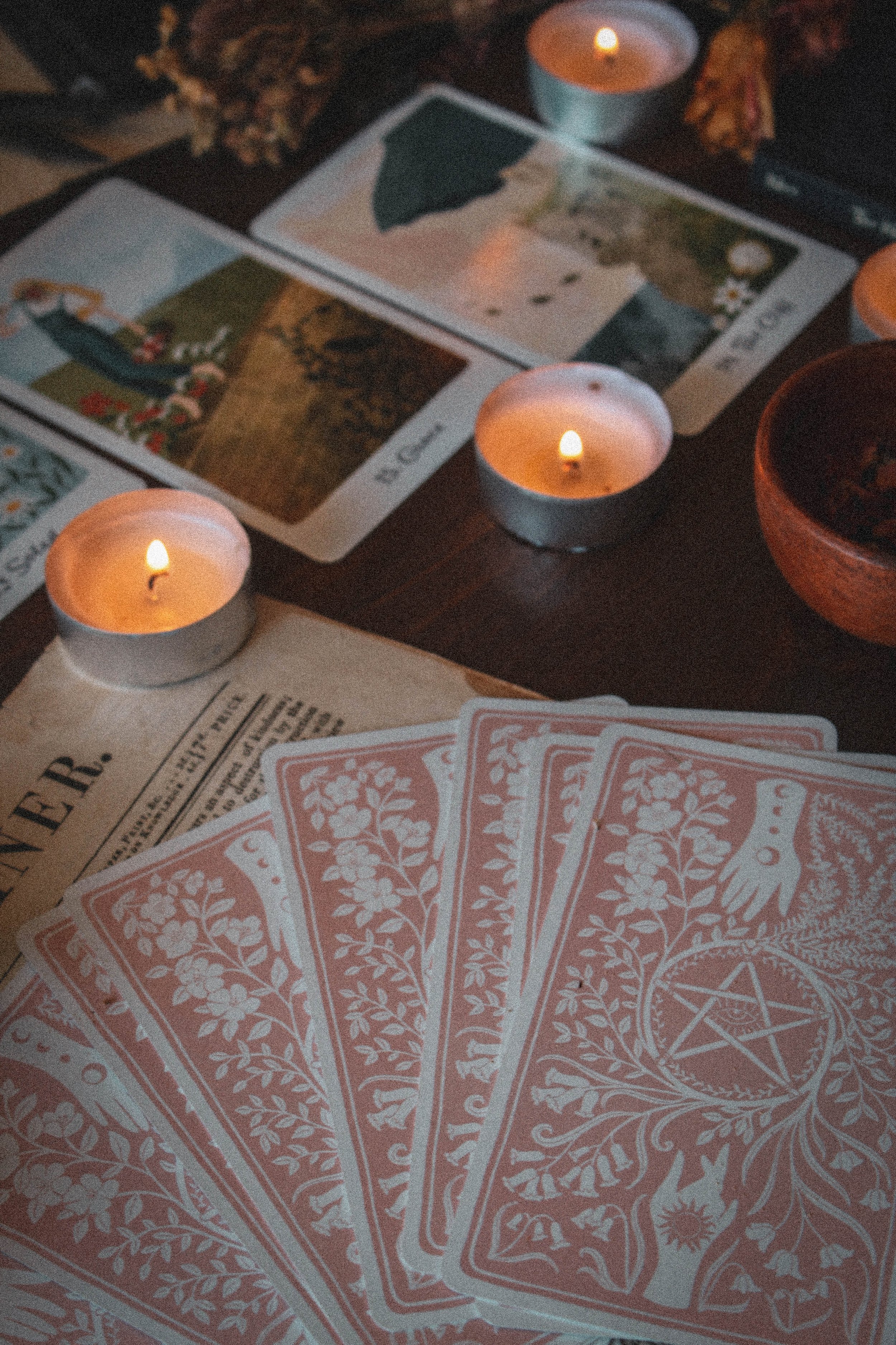
The box is perfectly fine. It's smaller in size but still holds a pretty nice guidebook and card deck. It's a purple box with pink foil and has the regular box feel which isn’t a surprise since it's an older deck. The cards are the right thickness. This is actually the thickness that I prefer as they aren’t too rigid or too thin. Sometimes the thicker cards are really challenging to shuffle, especially for a tarot deck. Other times, they’re so thin that you end up bending the cards. This one hits the sweet spot and feels like they will be sturdy enough to last but not so thick you feel like you’re shuffling plywood.
But there’s no gilding. Sigh. Again, this is an older deck but I get really sad when I don’t see gilding. And I’ve been dreaming of the color. A soft peach perhaps or a pink to match the foil on the box? A periwinkle blue or maybe a nice green? Sadly we get none of that and I do find myself missing it on this one.
The Guidebook
It's a pretty nice guidebook in terms of information. You don’t get a photo of the cards but you still get a lot of tips and tricks. Each card has a straightforward meaning and there are no dedicated reversal meanings even though you’ll find a section on how to do reversals with this deck. The book itself contains an introduction, section on the history of tarot, how to read the cards including how to read for other people and beginner tips, and seven card spreads. All of that is more than enough to get you going, even as a beginner.
I especially loved the section on how to read reversals if you choose to use them. As I mentioned, she doesn’t give you the reversed meanings but she does give you plenty of inspiration to find the meaning on your own. I think this is a great idea for beginners. For one, it gets you comfortable with trusting in yourself to work with the deck the way you see fit. But it also helps you to learn how to create your own meanings without relying solely on the guidebook. I really think if you’re a beginner, you will be well taken care of with this guidebook.
The Artwork
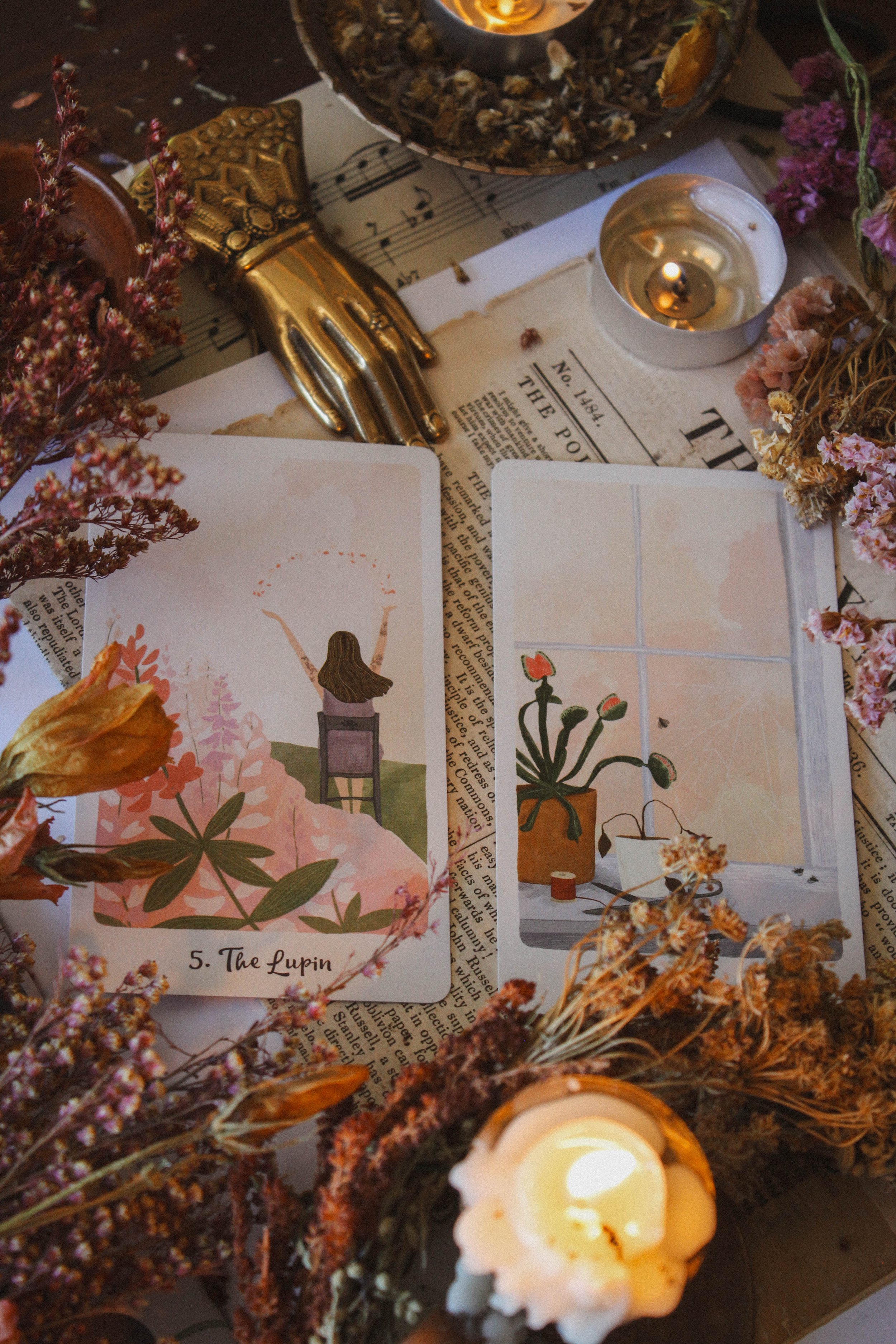
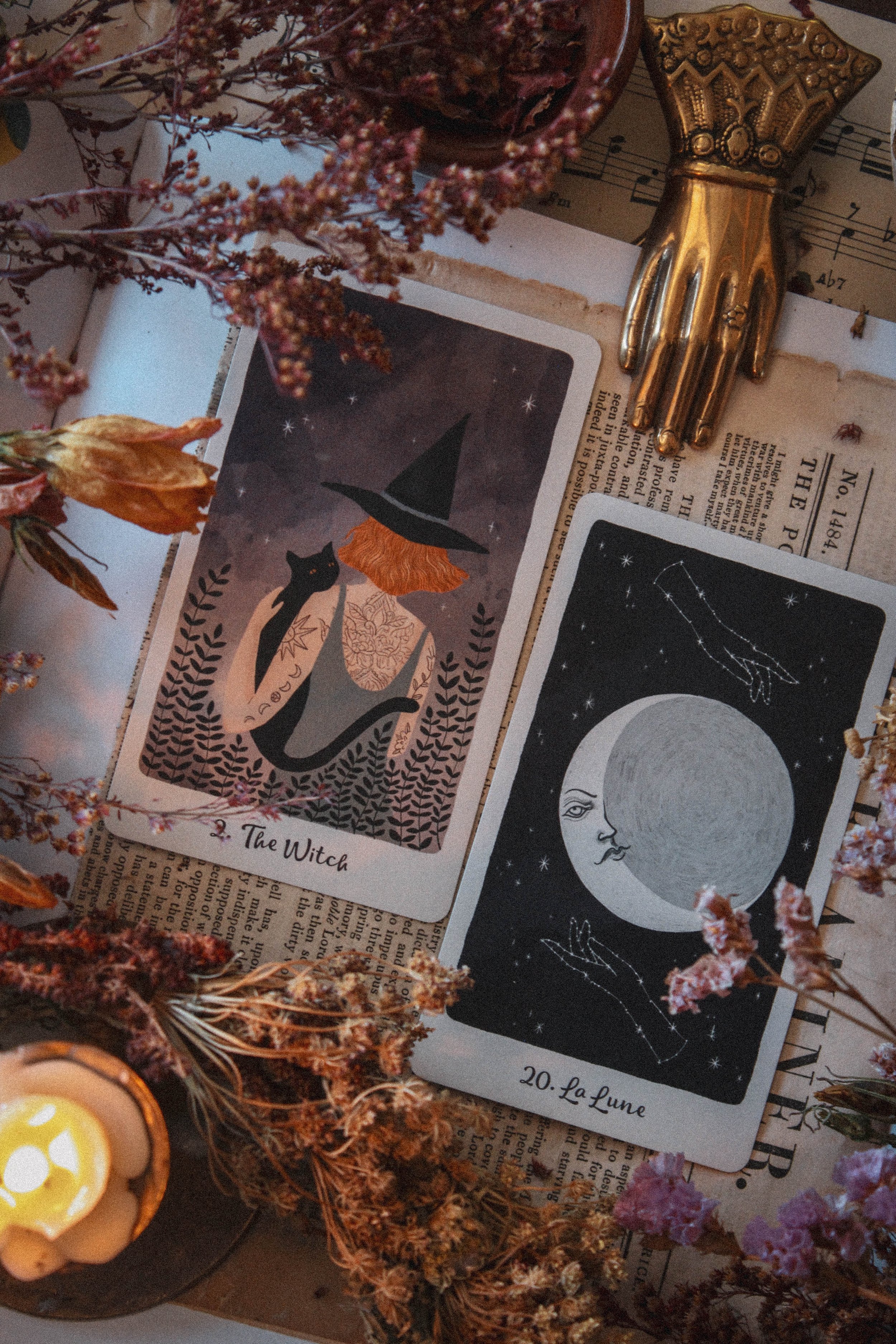
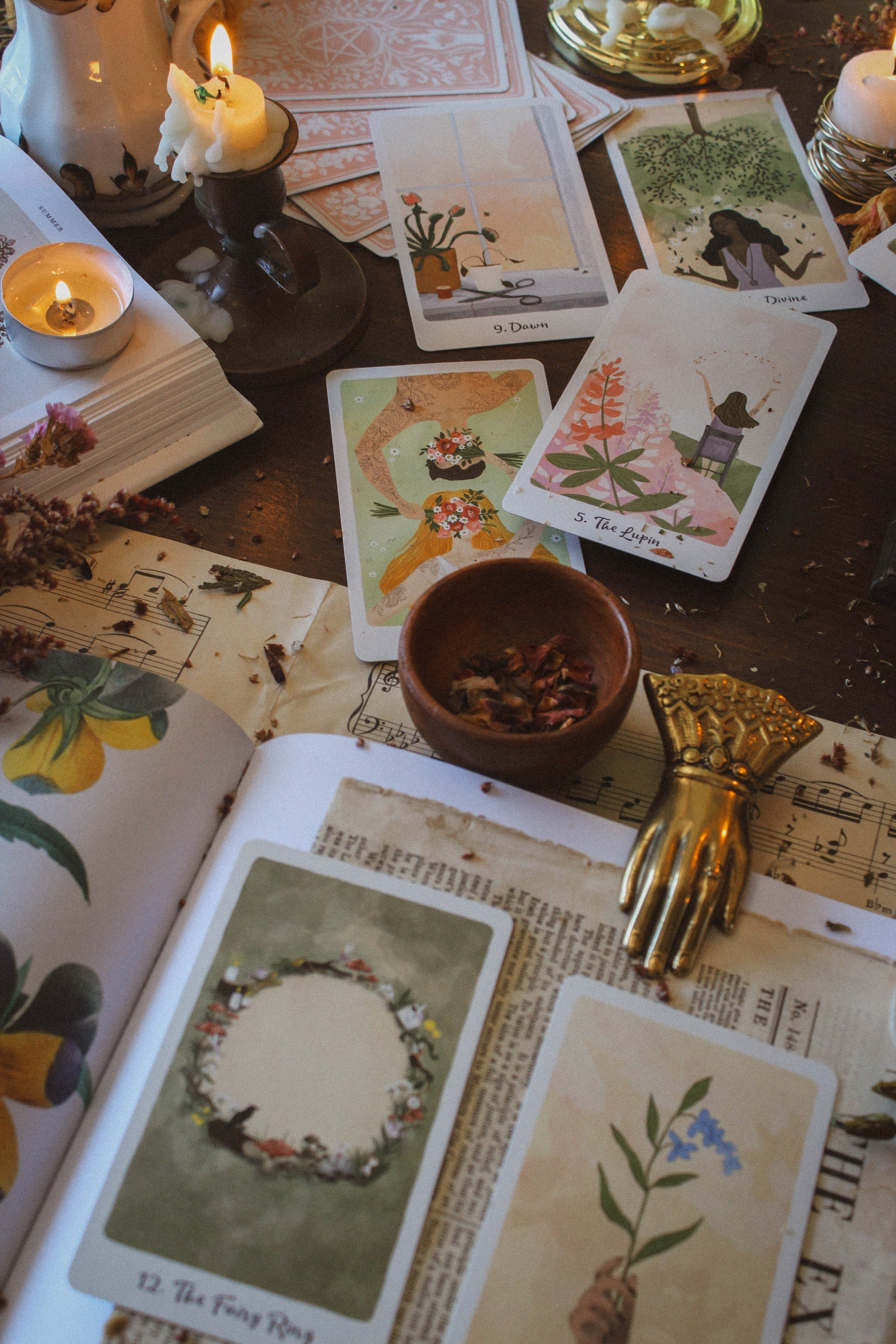
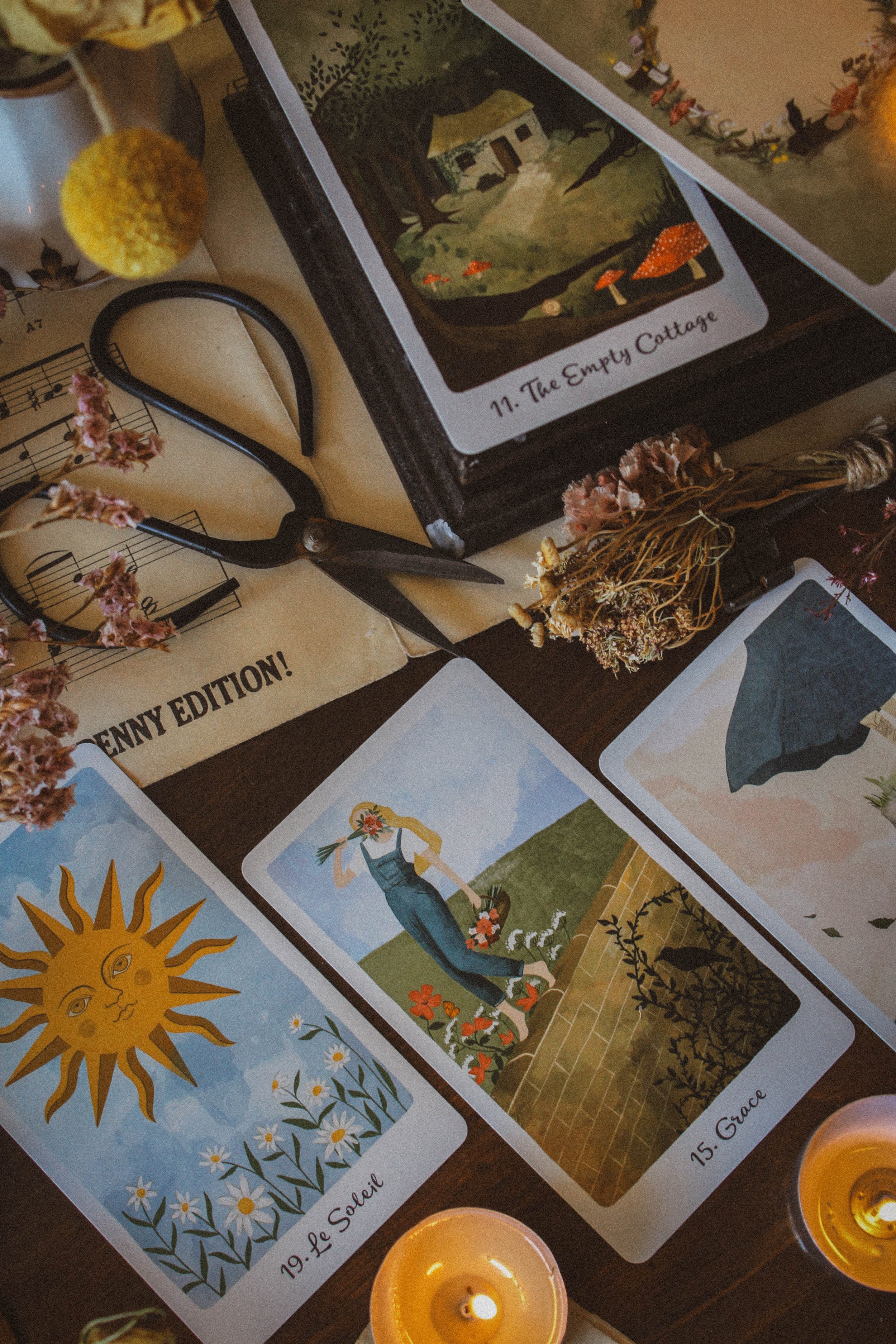
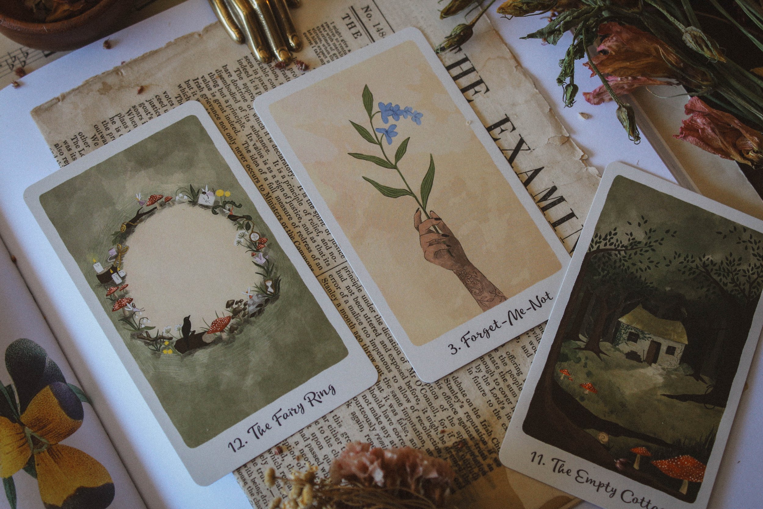
I do love the artwork and that’s what drew me to it. It's feminine and soft. The color palette is very pleasing on the nervous system featuring various shades of greens and colors you’d expect to see at your local garden center. And the major arcana is beautiful. Many of the titles have been renamed like the sun is now Le Soleil, which is just the sun in French. Not sure why but looks lovely all the same. And in some cases, the new name is nothing like the old like number 15 which is traditionally the devil but called Grace here or number 11, traditionally known as Justice but renamed the Empty Cottage here.
Which reminds me a lot of the Wildwood Tarot. Like the Harmony Tarot, it's somewhat based on the Rider-Waite system but really reads entirely different. It has its own ecosystem and you’ll lose the heart of this deck by trying to force it into those traditional RWS meanings. This is one of those decks where you’ll have to unlearn what you know about each card and replace it with something unique to this deck.
“You do not have to know all the card meanings by heart. At the start of your journey, tarot card readings will not flow and it's perfectly OK if you need to refer to the guidebook”
My favorite card is Le Soleil, mostly because I’m entering my happiness and abundance era and I’ve been attracted to the color yellow, suns, bees, and gardens. I also appreciate the sun by itself. The baby on the old RWS is kind of weird and if I’m honest, it never really resonated. It makes me think of children, not so much happiness and those two things are not always the same. This feels a little more modern and adult.
My second favorite is Forget-me-not which is the state flower of one my favorite places on earth - Alaska. And The Cliff reminds me of Hilltops from Seasons of the Witch: Lammas Oracle. And I loved Grace. The girl walking on the concrete fence with flowers on one side and a thorny bush on the other felt like a perfect way to portray this card. Continued below…
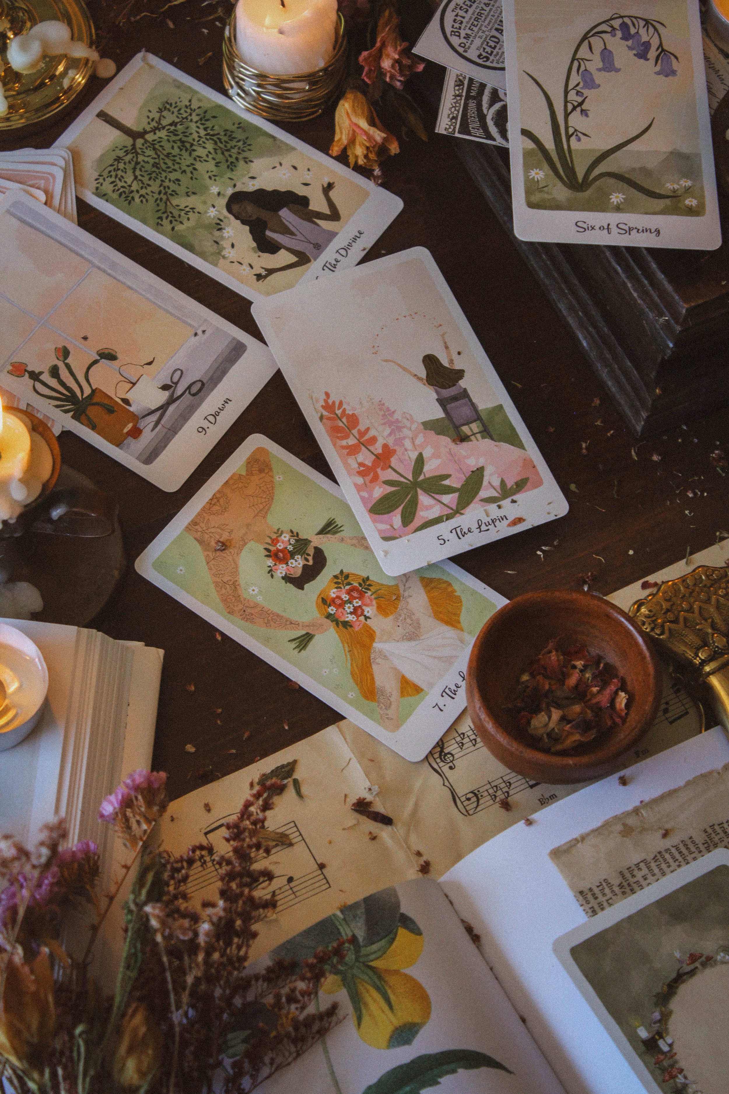
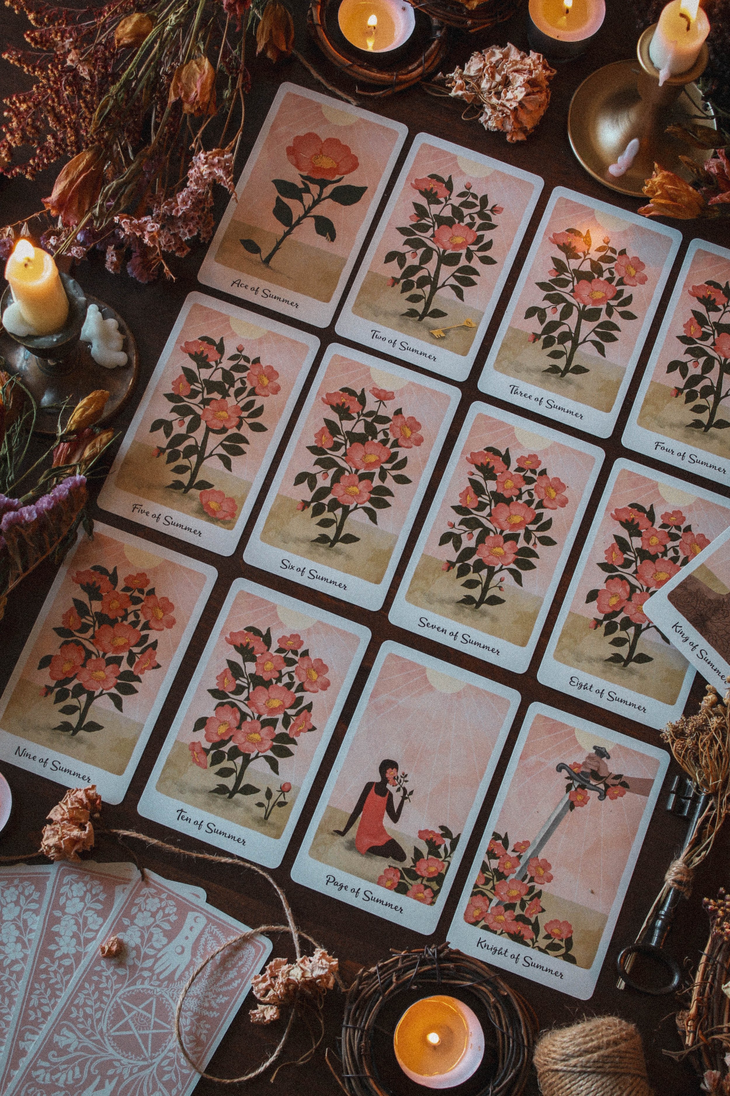
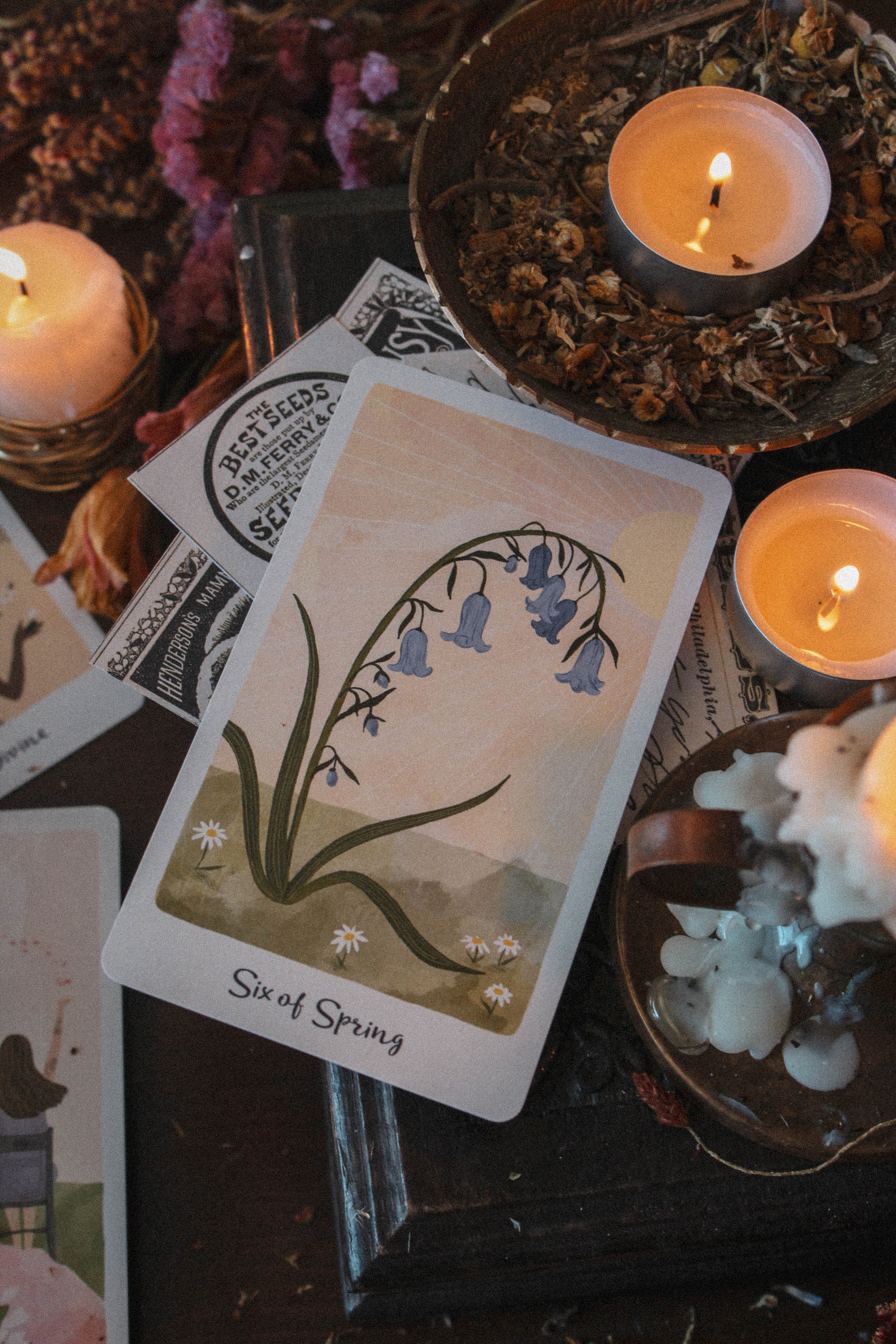
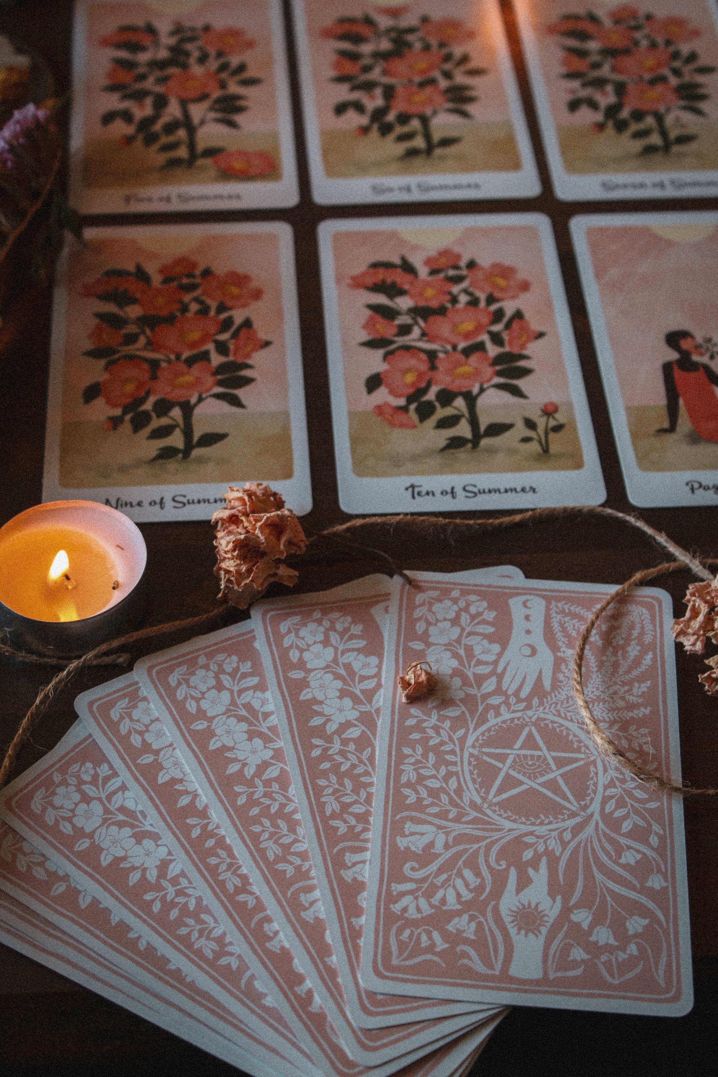
So here’s where things take a bit of a turn. The artwork for the suits feel like the same card over and over, especially at first glance. In fact, I had to do a double take because I thought they were all the same my first time going through them. There is a clear distinction between the suits. Each suit has its own color palette and corresponding plant. Spring for example is represented by bluebells and winter is represented by snowdrops. But within the suit, you see the same plant, growing throughout the season.
Summer for example, features dog roses. The ace of summer features one singular dog rose but then the two of summer features a dog rose plant and its the same plant image all the way through to ten. New flowers open up as you move higher up the sweet. The two of summer has two open flowers while the ten of summer has ten open flowers. Things change on the ground periodically; the ten of summer has a small bud off to the side and the four of summer has a petal on the ground. Everything else is exactly the same. Same sun, same ground, same background, and same layout.
I debated whether or not to include this because to be fair, changes do occur within the cards and I get the reasoning for it. It's supposed to represent steady growth but visually, I feel a bit cheated and I would be lying if I said otherwise. This may not matter for you and that’s totally fine. But for me, aesthetics are a big part of my spiritual journey and I just found myself wanting a bit more. It also reminded me of the Penny Dreadful tarot based on the Showtime show. The images in the suits were literally the exact same card, 56 times if I remember correctly. I gave it away because that deck pissed me off so I can’t verify it. But I distinctly remember there being no difference at all. This isn’t quite like that but it's close enough to trigger a similar feeling.
Having said all that, it doesn’t take away from the accuracy of the reading but as I said earlier, you need to give this deck space to be different from the Rider-Waite- System. If you look at number 15 and try to read it like the devil card, then you’re going to miss the true meaning of Grace. You really have to meet this deck where it is and if you do that, I think you’ll enjoy working with it a lot.
Season, Sign and Sabbat
I went with summer for this one. I don’t know if you agree but I feel like each month has a color and the colors in this deck reminded me of May to July. The colors are soft but feel like they’re a bit exposed to use a photography term. It feels like a series of photos taken in the middle of a bright summer day.
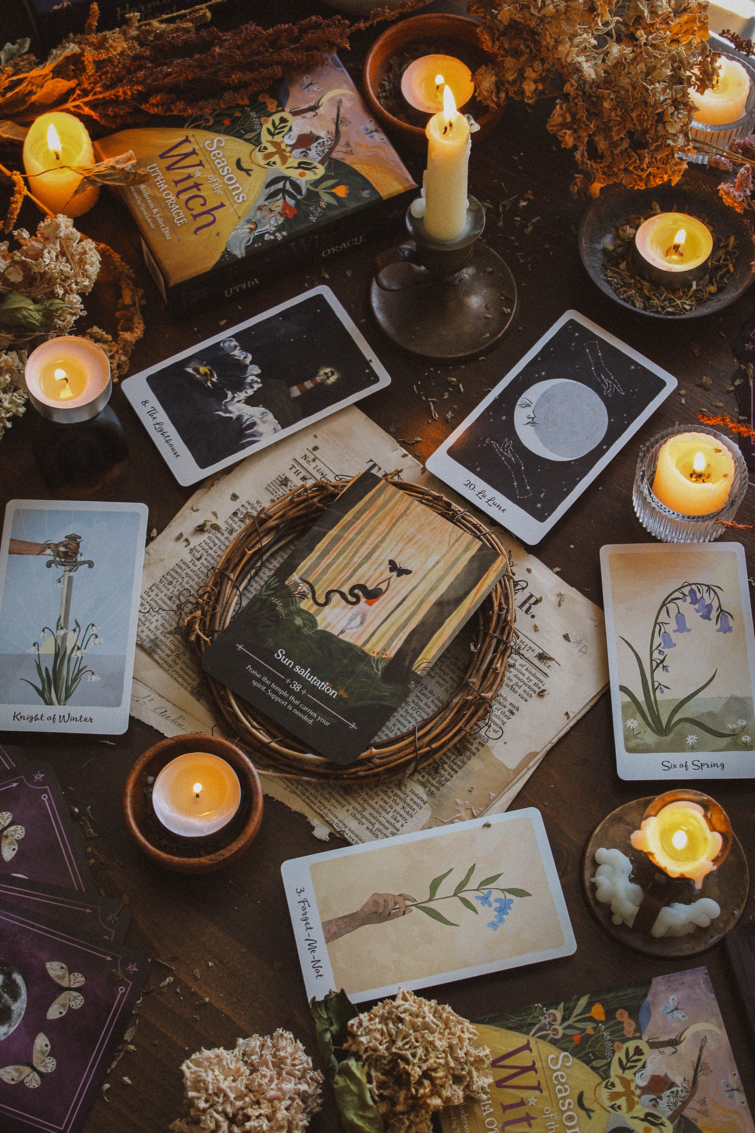
However, it is still very pastel which brings to mind Ostara. I feel as though this will be a great deck to pull out just as Ostara starts and will take you through to Litha or even just before Lammas. I also think it will match the Seasons of the Witch: Ostara Oracle when it comes out (find a super sneak preview in the Spirit Realm member portal). But I could really see myself using it with Seasons of the Witch Ostara, Beltane and Litha rather easily.
But I feel a strong Libra sense here which could also connect to Taurus since they both share Venus. But the color palette, softness of it, and the harmony all feel like Libra energy. It's very feminine and graceful and you do get a strong sense of balance. In fact, my deck interview told me to seek this deck out when I need to bring my life in balance which is 100% a Libra quality.
Who is this deck for?
Are you in your gentle era? Then this deck is for you. It just feels good to work with it. I feel like I want to slow down and take a deep breath when I work with it. I don’t think it's going to be your shadow work deck or your manifestation deck or even your happiness deck. I think it's perfect for those lazy days when you just want to bask in the sun or wear your favorite old t-shirt and tattered jeans all day. It's a “pack it in your picnic basket” with your rose and copy of Pride and Prejudice sort of day. No fires or sadness to work through. Just peace and calm.
Oracle Deck Companion
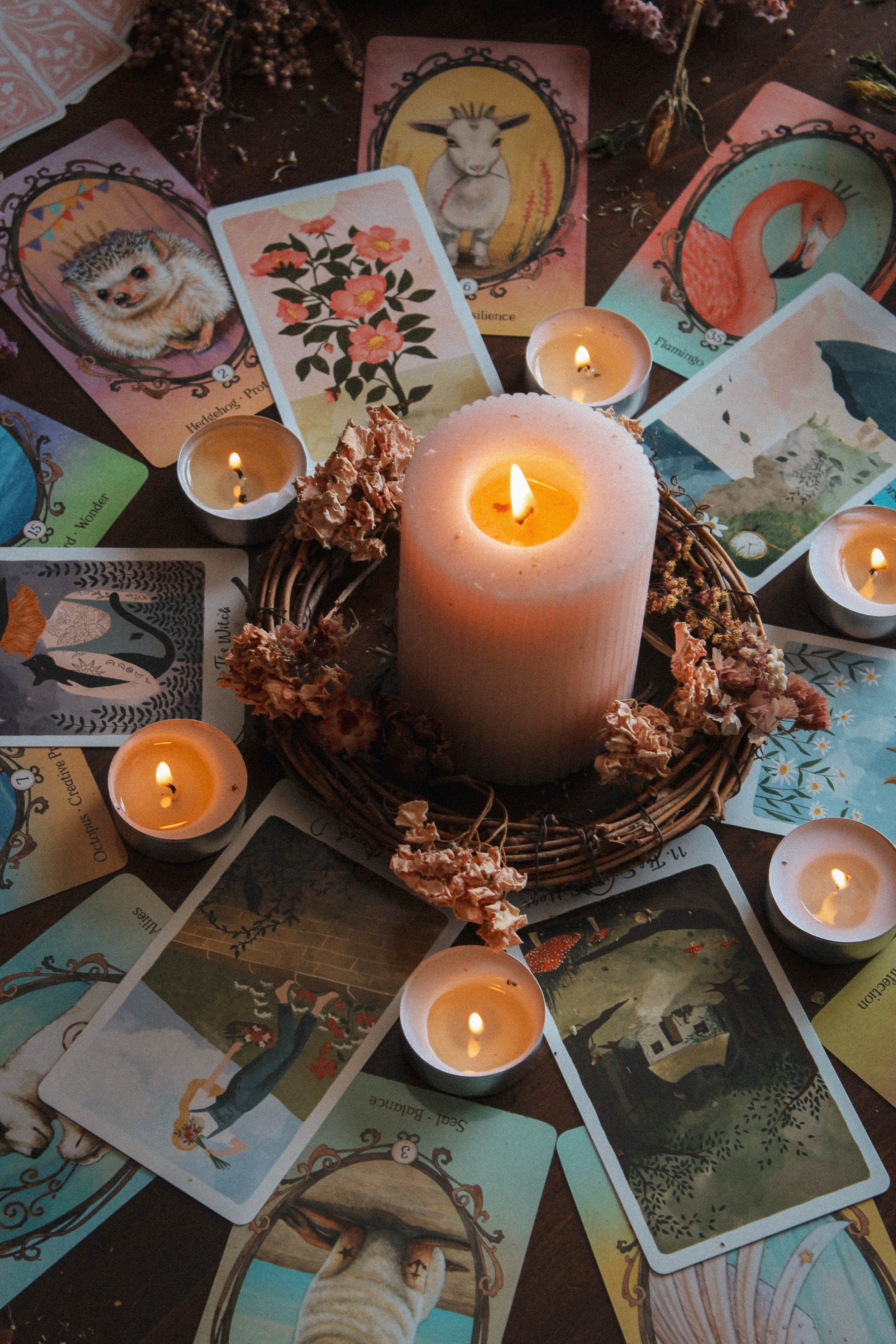
I’m pretty sure I’ll update this to Seasons of the Witch: Ostara when I get the sample (it hasn’t even gone to print yet) but for now, I love it with Wing, Hoof and Paw. I actually did the reviews for both of these decks on the same day and I couldn’t believe how well they played together. The color palette is nearly identical and they both feel very sweet and kind. Energy well matched indeed.
Thanks for reading all the way through. If you found this review to be helpful, informative or entertaining in any way, please be sure to leave a comment down below. It really helps me know what you’re enjoying so that I can provide more content based on what you love.
And of course, if there is something you’d like me to consider reviewing, please comment below or email me at hello@spiritelement.co
