Galactic Guides Review
Written By: Victoria Maxwell
Illustrated by: Ellie Grant
Publisher: Rockpool Publishing
Number of cards: 36
Card size: 5 in x 3.5 in
Box size: 5.5 x 4 x 1.25 in
Guidebook pages: 135
Purchased or gifted?: Gift from Rockpool
Absolute favorite card: Venus
Other favorites: Jupiter, Taurus, Neptune, Cygnus, Saturn, Pluto, Procyon
Notable detail: holographic sides and box detail
Season: none (see bottom of post)
Sabbat: none (see bottom of post)
Sign: none (see bottom of post)
Tarot Deck compliment: The Linestrider Tarot
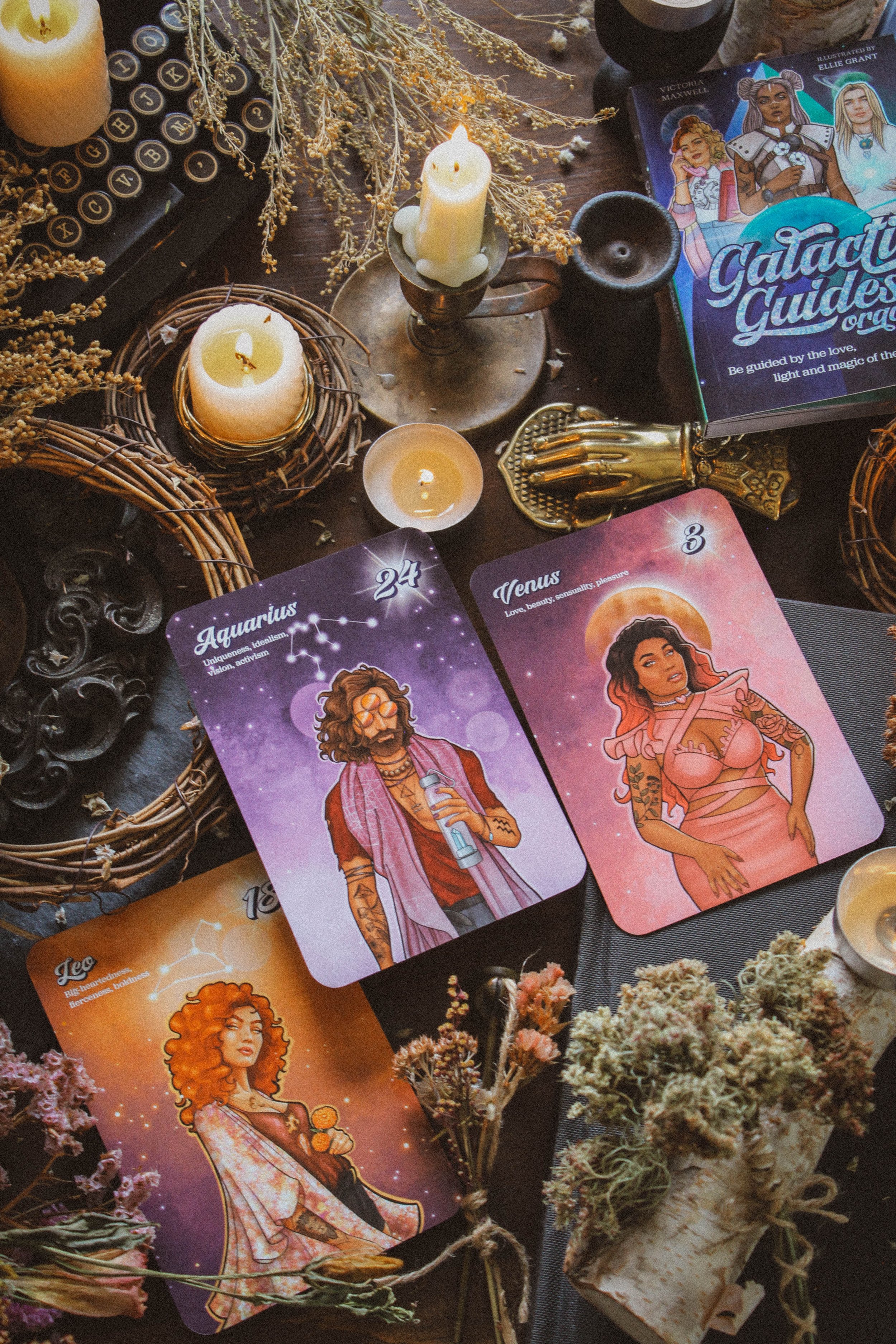
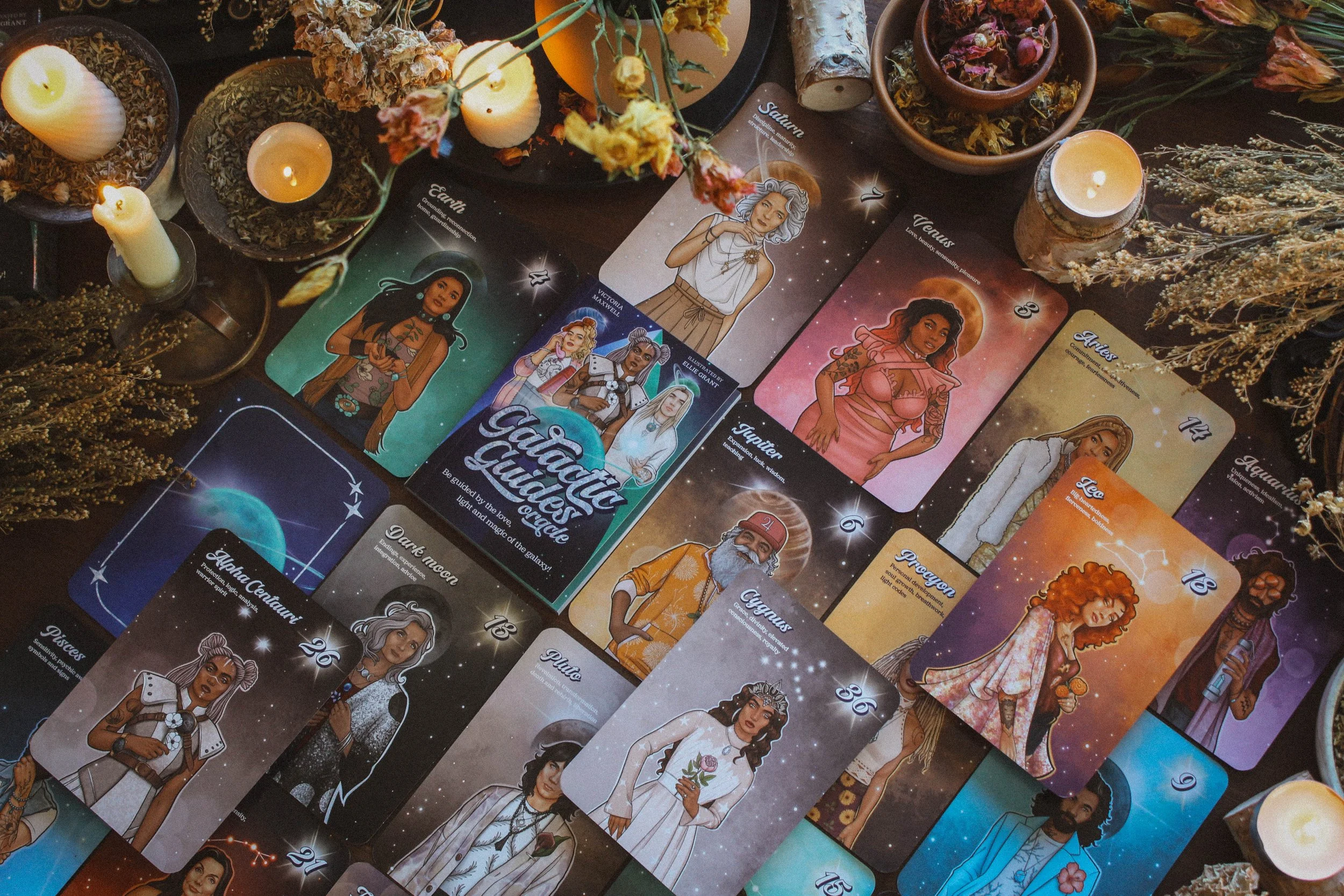
First Impressions: I immediately loved the updated interpretation of the planets and signs. Saturn which is generally considered to represent the father is a woman, Venus is a voluptuous Diva who kind of reminds me of Megan Thee Stallion, and Aquarius is a dude wearing third eye sunglasses. It’s fun, playful and totally unexpected but still represents each astrological theme beautifully.
The Packaging
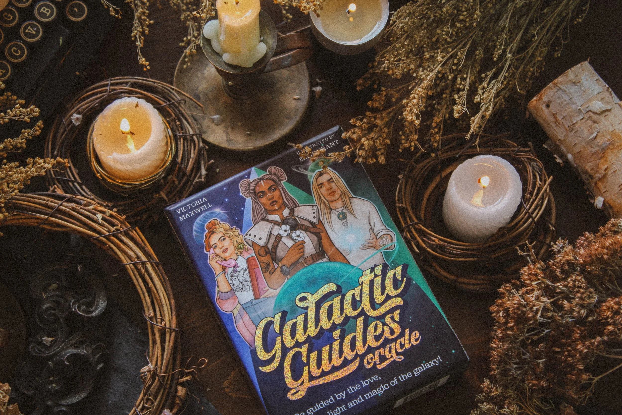
Our first stop is packaging which is gorgeous. Rockpool always does a really great job with their packaging and I credit a lot of the more modern look and feel many other publishers are adopting to them. They always have really unique gilded edges (the edges are always gilded and if you’ve been reading for a while, you know how I feel about lack of gilding), the boxes have surprising details and the construction is nice and sturdy. This is no exception.
I love the holographic details which catch the light so beautifully. Turn one way and it’s blue and green then another and it’s orange and purple. You can see some of the photos below, featuring the light play. I could’ve spent an hour, turning this way and that, just trying to catch the whole spectrum of colors. And the box has the same matte feel as the Seasons of the Witch oracles (Rockpool is my publisher too). My favorite little detail are the stars where you place your thumbs to open the box. I love tiny surprises like that. That intentional attention to detail shows care for the overall experience. Well done!
The Artwork
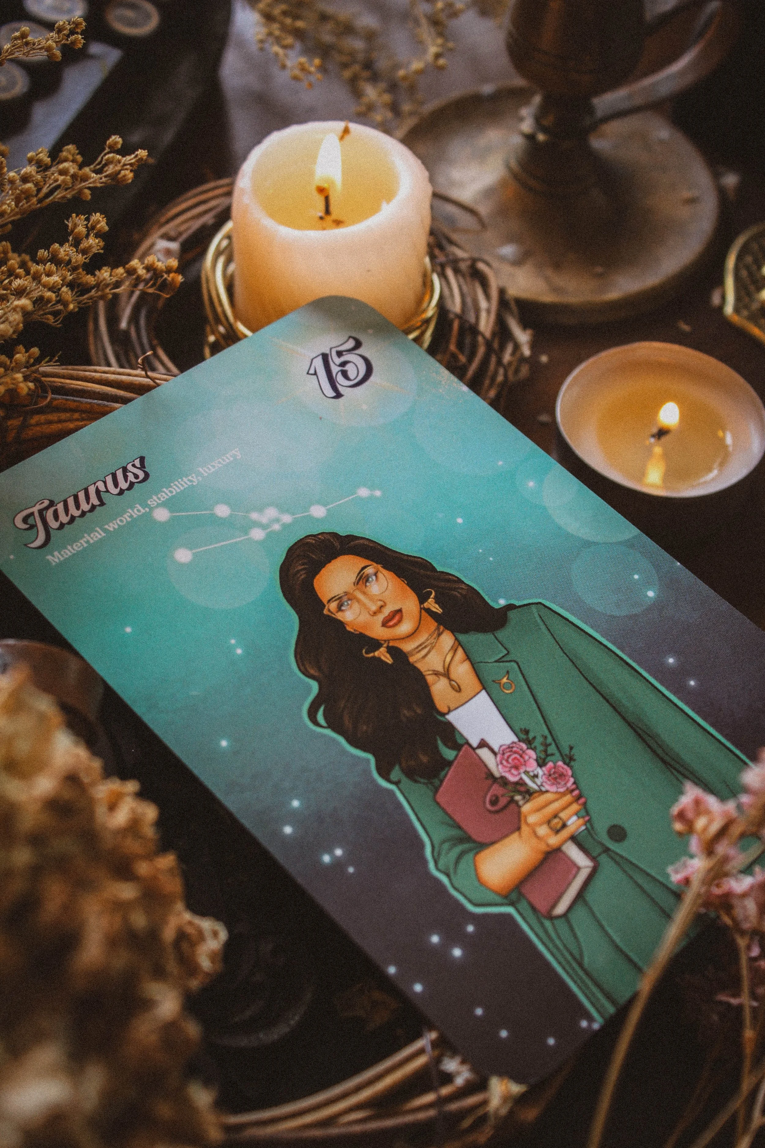
Victoria’s decks always feature a wide variety of skin tones, hair types, body types, and all kinds of different people. There was a time, not so long ago, when you saw one type of person in oracle decks but seeing a deck like this really makes me feel like those days are gone. The colors are nice and rich in different shades of various jewel tones. And if you look closely, many of the figures have tattoos. I think that’s so fun and really makes this deck feel modern.
My absolute favorites are Leo, Aquarius and Venus. I love the tones of Leo most but I also love her hair. I don’t know why but big curly hair is always the first thing I think of when it comes to Leo and I feel like this one kind of just captured the essence of Leo quite well. I love the Aquarius dude (he feels like a dude to me). He’s cool, laidback, kinda in his own world and doesn’t that sum up Aquarius pretty well? He has mushrooms and the glyph for Aquarius as tattoos and carrying a crystal infused water bottle. I think the creator and the illustrator did such a great job, choosing elements which perfectly align with each character. It’s kind of like a little list of correspondences in every image.
Jupiter has dandelions on his sweatshirt representing travel and expansive energy, Pisces has an eye in the middle of some clouds on his vest to symbolize fantasy and transcendence, Neptune has coral on his shirt since Neptune is the Roman God of the Seas and the dark moon is presented by an older woman whereas the new moon is a younger girl. Many view the dark and new moons as the same thing but there is quite a subtle difference. The dark moon is the last stop on the waning moon side so an older, crone like energy is absolutely perfect. The new moon is the first stop on the waxing moon side and youthful energy is perfect for that. All this to say, you can tell the artwork is very thoughtful and intentional.
“Understanding and working with celestial bodies is not always easy: In ancient times astrology was a lifelong study undertaken only by a chosen few.”
The Guidebook
I love Victoria’s reasoning for creating this oracle. In fact, I have been talking at length with my next oracle partner about pretty much what she describes in the book. She discusses how challenging and overwhelming astrology can be. There is a lot to learn and it really is its own language. Which is why most people don’t get much further than their sun sign. But astrology has so much to offer and Victoria has “personified the heavens to help you get up close and personal with the divine energy of the universe.” I love that statement so much as it’s what I do in my own practice. Personifying a theme helps you to communicate with it in a way that feels like advice, friendship and support. I would say most astrology decks are pretty much the same but this one kind of reinvents an old formula, making it feel new and more accessible. Continued below…
The guidebook is full color, something Rockpool always does. They’re so good about their guidebooks. Their packaging is a huge part of why I hope to call them my forever publisher. What I love most about the book though is that Victoria includes a meaning for love, money, purpose, service and spirituality for every card in addition to journal prompts, the light and shadow of each card, and a list of correspondences. That is a lot of information! I’m always so impressed by authors who offer meanings for different interpretations. It’s not that easy to write one meaning for 30 something cards, let alone 7 individual meanings. You go Victoria cause wow, I’m not sure I could’ve done it.
You’ll also find four spreads, a section on how to use the cards, one on expanded meanings, and a nice intro that is definitely worth the read.
Sadly now, we’re at the part where I talk about what I didn’t like about this deck and I intentionally saved it for last because everything else about this deck is so lovely and well done. But the readability of the guidebook is problematic. The bottom of every page is a mid to dark purple but the problem is that the text is also a mid to dark purple, making it really challenging to read. I’m not sure what the thought process was here but I don’t think it was a good choice. I’ve found it challenging to read many of the pages already.
I love the deck other than that. I would recommend this deck before pretty much any other astrology deck I’ve ever had. I find it very intentional, in-depth, and thought provoking. When I did the deck interview, it told me this is a deck for challenging traditions, being unique, learning to find confidence in what makes me different and taking action on my dreams and goals. Your interview will probably be different from mine but, I do feel like that sums up this deck rather nicely and pretty much anyone can expect the same. This is a deck that breaks the norms so it makes sense that it will help you be a little revolutionary in your own life too.
Season, Sign and Sabbat
I didn’t choose a season or sabbat because this isn’t really an earthy deck. It’s cosmic and I felt that deserved to have a space outside of earth terms. I did choose the spirit element for this deck though. I don’t usually choose an element for each deck but this one feels so divine and deserved its own special category. I also didn’t choose a sign because every sign is represented so kind of no need.
“Always follow your intuition and enjoy discovering how these cards work for you.”
Who is this deck for?
I think you’ll love this deck if you’re an astrological enthusiast and would like to learn more or to understand how various astrological themes can manifest in your life. I also think beginner readers will really benefit from this deck because it gives you so many interpretations. Beginners always tell me they have a hard time knowing how to adapt a meaning for their question and this one basically does that for you. So you’ll be able to see how one meaning can go in many different directions.
Tarot Deck Companion
It took me a while to find tarot companions but I ended up pulling out two older decks: The Aquarian Tarot and the Linestrider tarot. I looked at the Aquarian tarot and put it down but then I kept thinking about it. It nagged at me until I gave in and used it with Galactic Guides and you know what, they resonated. I’ve always thought of the Aquarian Tarot as very masculine and something about Galactic Guides softens it a lot.
And then Galactic Guides is very colorful so I choose Linestrider which is much more on the minimal side but mirrors unsaturated versions of the same color palette against a white backdrop. It makes such a nice contrast and I’ve really enjoyed the combo.
Thanks for reading all the way through. If you found this review to be helpful, informative or entertaining in any way, please be sure to leave a comment down below. It really helps me know what you’re enjoying so that I can provide more content based on what you love.
And of course, if there is something you’d like me to consider reviewing, please comment below or email me at hello@spiritelement.co
